(About TAYO)
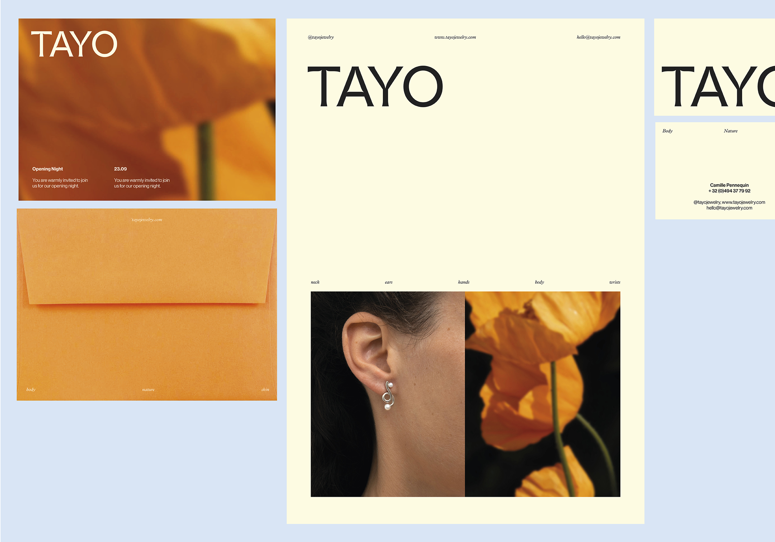
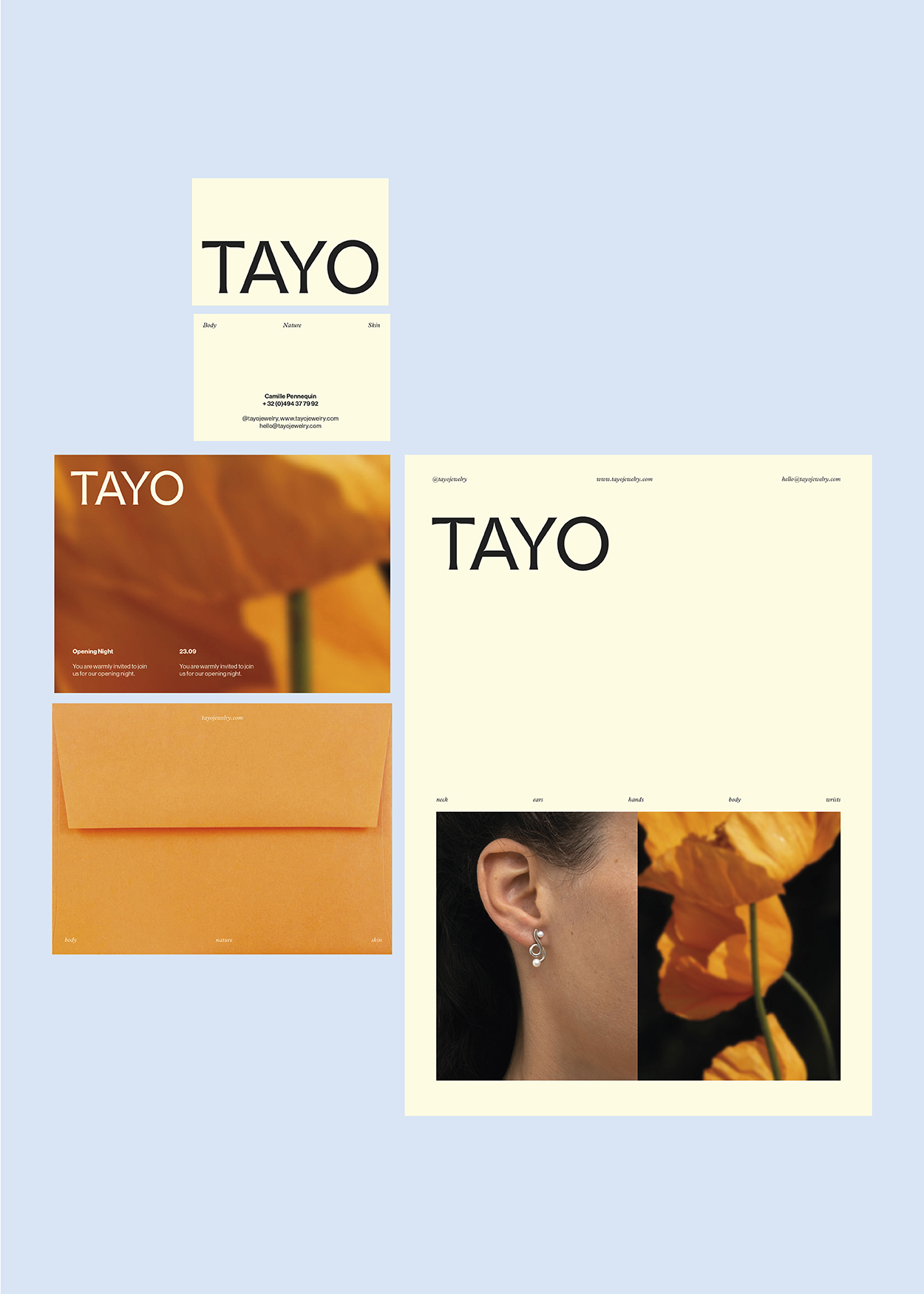
TAYO originates from the ancient French expression taïaut, a spirited cry that once resounded through hunting grounds, signaling the discovery of game to fellow hunters and companions. This vibrant exclamation embodies Camille’s jewelry brand, as she channels her creativity into one-of-a-kind pieces, extending an invitation to others to join in the hunt for moments of beauty, inspiration, and connection in the day-to-day.
In crafting the narrative of TAYO, we endeavored to mirror Camille’s innate sensibilities. Much like her pieces, which are raw and expressive, the storytelling resonates with a similar depth and subtlety. Every word carries intent, highlighting her craftsmanship and artistry, while also effectively communicating her experience and expertise.
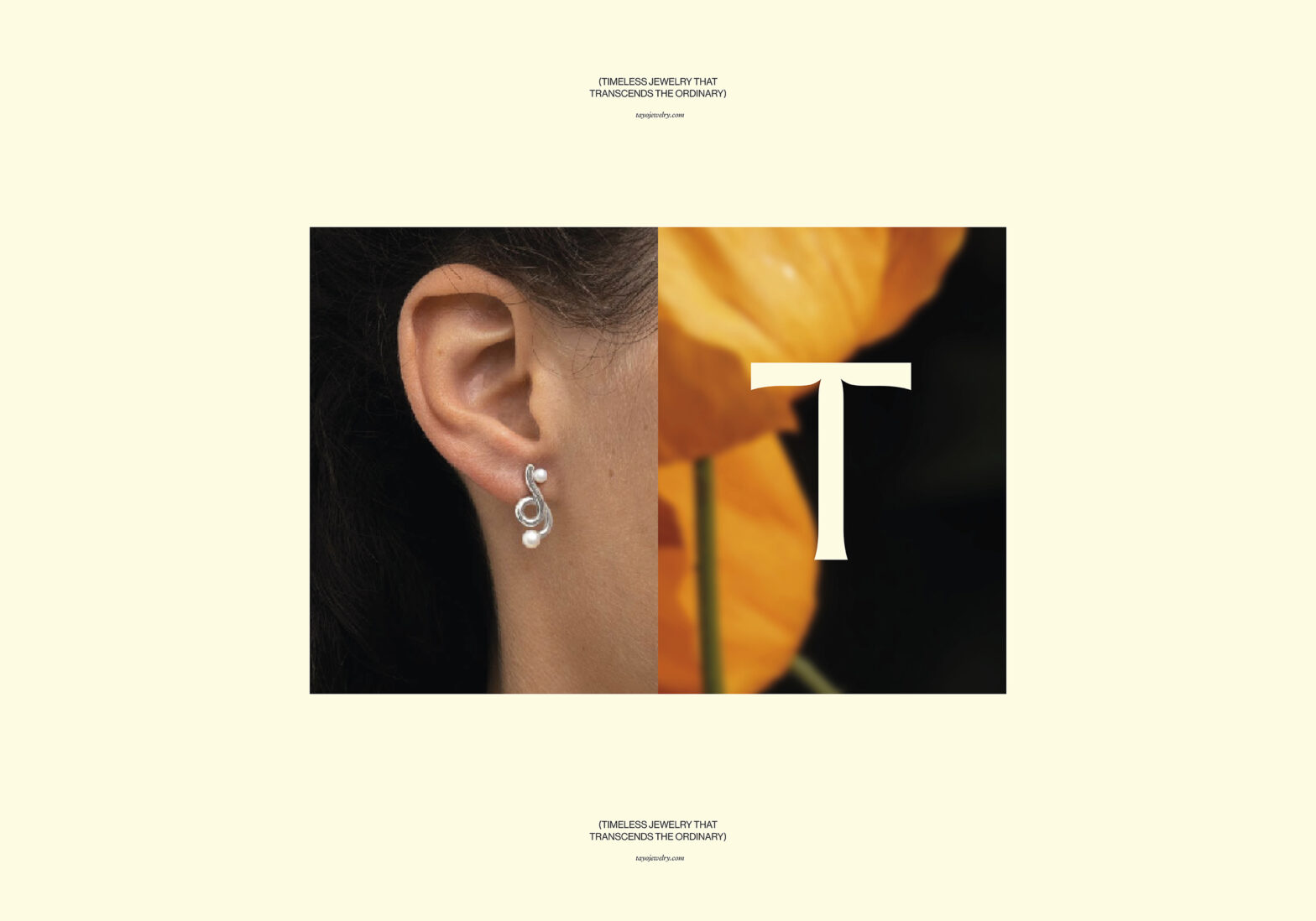
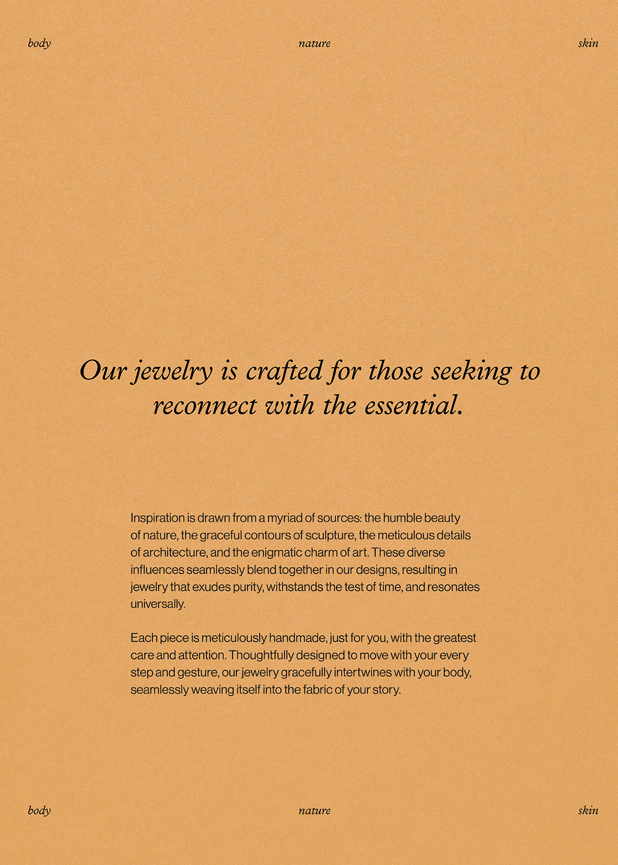
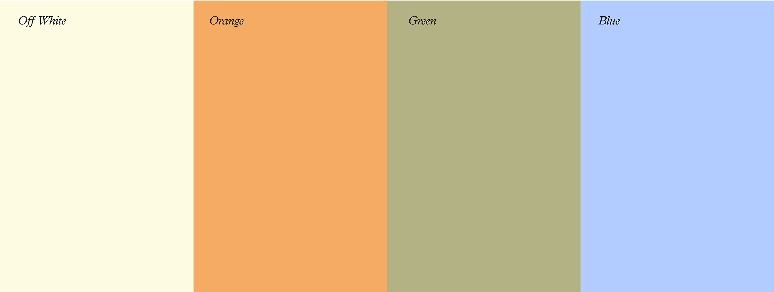
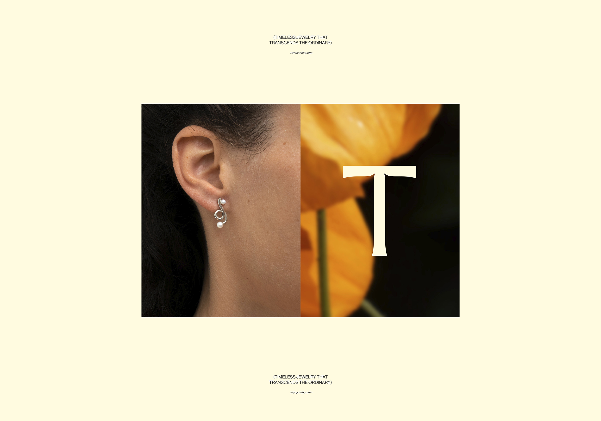
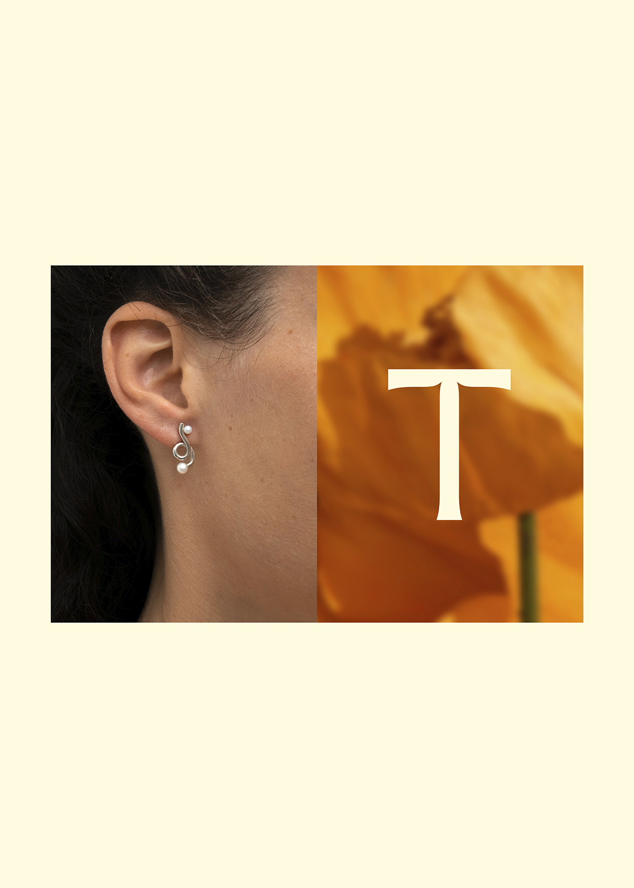
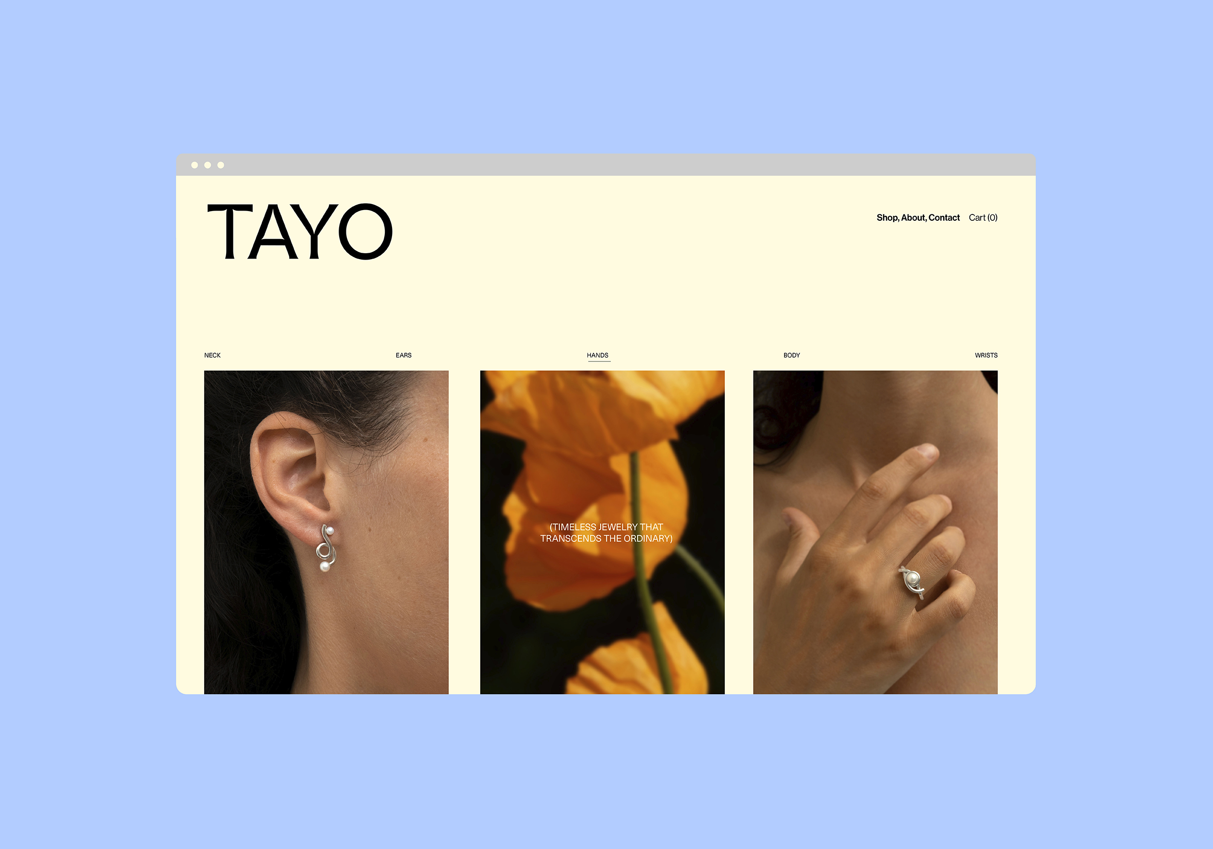
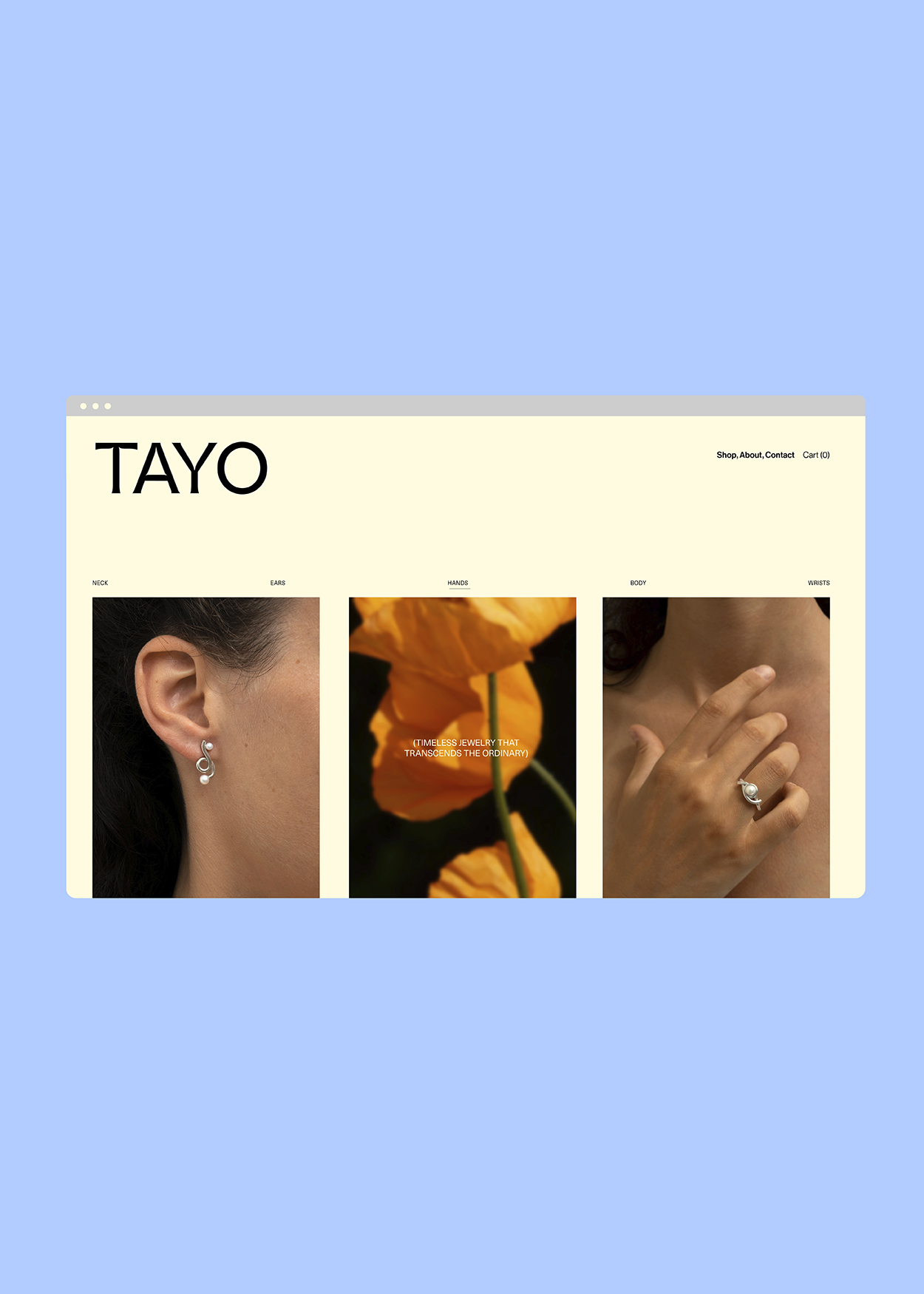
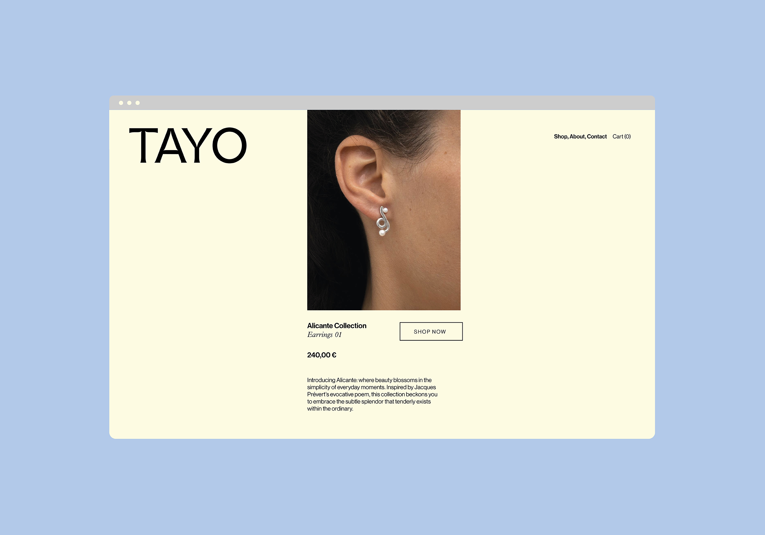
Guided by her singular vision, we designed TAYO’s identity to incorporate fluid and graceful elements that convey both contemporary sophistication and the understated luxury found in Camille’s jewelry. With a bold sculptural logo and a color palette inspired by nature’s soft blues and warm orange hues, the identity represents the spirit of TAYO: strong, in tune, and grounded.
Story & Strategy Development — Branding — Collateral Design